Comparison
Drop-down menus vs visible answer options
Why students pick what they can see, and how to lay out choice questions
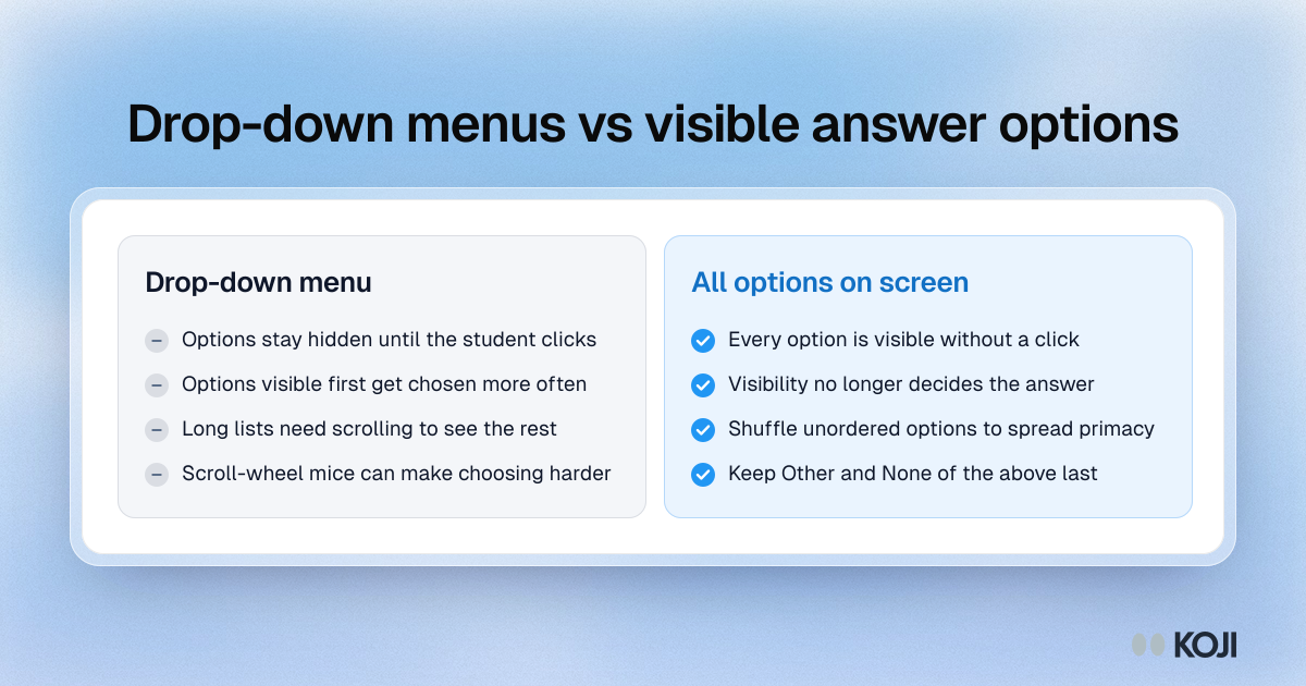
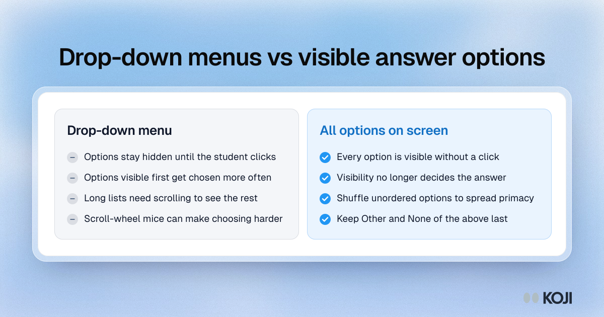
A side-by-side comparison of drop-down menus and answer options shown on screen, based on web experiments by Couper and colleagues and by Healey. Options that are visible without a click get chosen more often, a pull that was stronger than the bias towards the first option. Use it when designing choice questions in a course evaluation or student survey. Koji shows every option as a button and can shuffle the order for each student.
What's in this comparison
Drop-down menu
- Options stay hidden until the student clicks
- Options visible first get chosen more often
- Long lists need scrolling to see the rest
- Scroll-wheel mice can make choosing harder
All options on screen
- Every option is visible without a click
- Visibility no longer decides the answer
- Shuffle unordered options to spread primacy
- Keep Other and None of the above last
Use this image
Free to use in your docs, decks and posts under CC BY 4.0, as long as you credit Koji with a link to this page. To embed it, paste this into your page:
html
<a href="https://www.koji.so/visuals/drop-down-menu-vs-visible-answer-options"><img src="https://www.koji.so/visuals/drop-down-menu-vs-visible-answer-options/drop-down-menu-vs-visible-answer-options.png" alt="Comparison of drop-down menus and visible answer options in a course evaluation, setting the risks of hidden options against showing every option on screen." width="1200" height="630" /></a>
<p>Source: <a href="https://www.koji.so/visuals/drop-down-menu-vs-visible-answer-options">Drop-down menus vs visible answer options</a>, Koji</p>