Five-Second Test Questions: A Question Bank by What You're Testing
A five-second test question bank for landing pages, ads, logos, packaging and pricing pages, with the order to ask them, follow-ups and what a bad result looks like.
The short answer
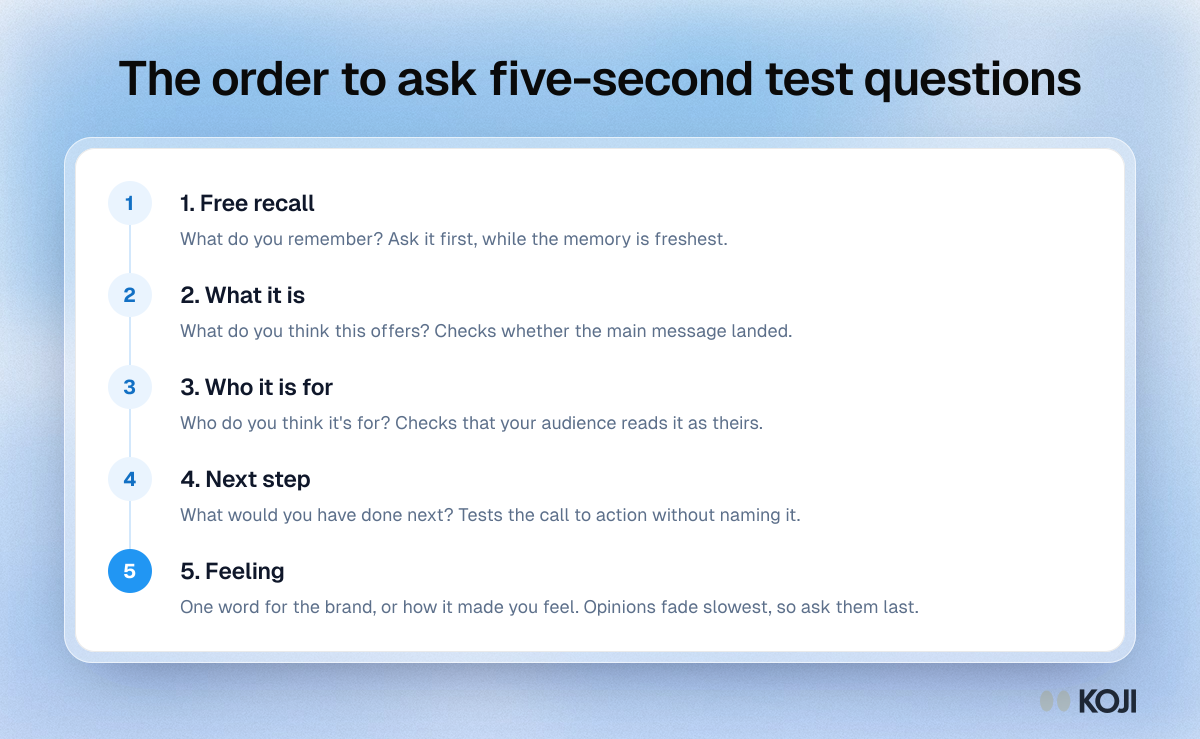
Ask five questions or fewer in a five-second test, and ask them in this order: what people remember, what they think it is, who it is for, what they would do next, then how it made them feel. Paul Doncaster, whose book The UX Five-Second Rules (2014) grew out of an analysis of 319 public five-second tests on UsabilityHub, puts the ceiling at five questions per image, because memory of the design fades with every answer. So the first question gets the freshest memory, and it should be the one you care about most.
Below is a question bank for the five things founders and small teams test most: a landing page, an ad, a logo, packaging and a pricing page. Each set has the questions to ask, the follow-ups that get you the reason behind an answer, and the result that should worry you. Pick one set, keep it to five questions, and run it with 15 to 30 people from your audience this week.
Why the questions matter more than the five seconds
A five-second test shows people a design briefly, hides it, then asks what stuck. The display time is the easy part. The questions decide whether you learn anything.
Two pieces of research explain why the window is so short. Gitte Lindgaard and colleagues found in 2006 that people form a stable judgment of a web page's visual appeal after seeing it for 50 milliseconds. Alexandre Tuch and colleagues, working with Google, showed 119 website screenshots and found that visual complexity changed how attractive people rated a page after as little as 17 milliseconds (Tuch et al., International Journal of Human-Computer Studies, 2012). The gut reaction comes first, and fast.
Five seconds gives people time for that reaction plus the headline, the main image and maybe the button. It does not give them time to read. Jakob Nielsen, summarising Microsoft Research's analysis of more than 2 billion page visits, advised that a page has about 10 seconds to make its value clear before people start leaving (Nielsen Norman Group, 2011). A five-second test checks whether yours does it in half that.
Recent work suggests five seconds is a starting point, not a law. Eduard Kuric and colleagues compared groups who saw pages for 2, 5 and 10 seconds and found that answers changed with the exposure time, the page's visual complexity and the participant's cognitive ability (Behaviour & Information Technology, 2023). Writing up the study, they concluded that "it would not be correct to refer to it as just a five-second test anymore, but rather an N-second test." In practice: use 5 seconds for a simple ad or logo, and 10 for a dense landing page or pricing table.
The rules for writing five-second test questions
Six rules cover most of what goes wrong.
- Five questions at most. Doncaster's ceiling. Past that, people answer from a fading memory or from guesswork.
- Facts first, feelings last. Ask what they remember while the memory is sharp. Opinions survive memory fade better than details do, so they can wait.
- Open before closed. "What do you remember?" before "Did you see a price?". A closed question plants the answer, and every question after it is contaminated.
- One thing per question. "What is it and who is it for?" gets half an answer.
- Never ask what they could not have done. Nobody used the navigation in five seconds, so don't ask whether it was easy.
- Don't name the brand or the goal in the instructions. Say "You'll see an image for a few seconds. Look at it as you normally would." Then let them look.
The question bank
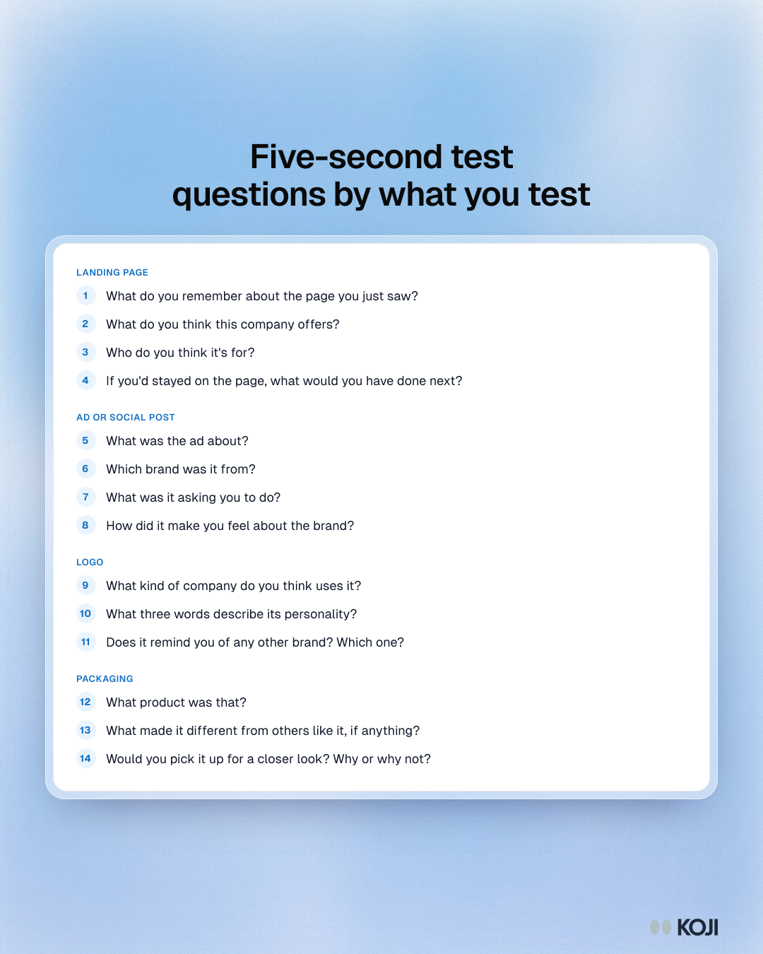
Each set below keeps to five questions. Swap in a question from the shared pool at the end when one doesn't fit your design, but keep the order.
Landing page or homepage
The question you are answering: does the page say what the product does, for whom, and what to do next?
- What do you remember about the page you just saw?
- What do you think this company offers?
- Who do you think it's for?
- If you'd stayed on the page, what would you have done next?
- What word would you use to describe the company?
Follow-ups worth asking: "What on the page made you think that?" after question 2, and "What would you need to see to try it?" after question 4.
Worrying result: fewer than about half of people describe the offer roughly the way you would. That is a headline problem, not a design problem.
Ad or social post
The question you are answering: does the ad get the message and the brand across before someone scrolls past?
- What was the ad about?
- Which brand was it from?
- What was it asking you to do?
- Who do you think the ad was aimed at?
- How did it make you feel about the brand?
Follow-ups: "What do you remember seeing first?" when someone can't name the brand. "Would you stop scrolling for this? Why or why not?" after question 5.
Worrying result: people remember the image but not the brand. A memorable ad that nobody can attribute sells someone else's product.
Logo or brand mark
The question you are answering: does the mark feel like the company you are trying to be?
- What do you remember about the logo?
- What kind of company do you think uses it?
- What three words describe its personality?
- Does it remind you of any other brand? Which one?
- How much would you trust a company with this logo?
Follow-ups: "What about it gave you that impression?" after question 2. Question 4 matters more than it looks: a mark that keeps reminding people of a competitor is a legal and positioning risk. For a full study, the logo testing guide goes deeper.
Worrying result: the words people pick in question 3 don't overlap with the brand values you wrote down.
Packaging or product shot
The question you are answering: can someone tell what's in the box and why it's different, from a shelf-length glance?
- What product was that?
- What made it different from others like it, if anything?
- Who do you think would buy it?
- Roughly what would you expect it to cost?
- Would you pick it up for a closer look? Why or why not?
Follow-ups: "What told you that?" after question 1. After question 4, "What made you think of that price?" reveals whether the pack looks premium or cheap. Packaging concept testing covers shelf tests in more detail.
Worrying result: people name the category but not the product's main claim.
Pricing page
The question you are answering: can people find a plan for themselves and tell the plans apart? Give pricing pages 10 seconds; they are dense.
- What do you remember about the page?
- How many options did you see?
- Which option looked like it was meant for someone like you?
- What did you think of the prices?
- What would you want to know before choosing?
Follow-ups: "What made that plan stand out?" after question 3, and "Compared with what?" after question 4.
Worrying result: people can't say which plan is for them. That usually means plan names describe the company's view of the plans, not the customer's.
A shared pool of extra questions
When a set doesn't fit, swap one of these in, keeping facts before feelings:
- What stood out most?
- What was the main message, in your own words?
- Was there anything confusing?
- What do you think happens after you click the main button?
- Where would you expect to see something like this?
- What, if anything, made it feel trustworthy or untrustworthy?
Questions to leave out
- "Did you like it?" Too vague to act on, and people are polite.
- "Was it easy to use?" They didn't use it.
- "Did you notice the button?" It plants the button. Ask "What would you have done next?" instead.
- "Was the design cluttered?" It hands people your hypothesis.
- Anything that needs the body copy. Five seconds isn't enough to read it.
How many people to ask
Five-second tests are usually directional. Fifteen to 30 people from the right audience will show you whether a message lands; if most of them describe the offer the same way, you have your answer. When you compare two designs, give each its own group so nobody sees both, because the second design is always judged against the first. Use screener questions so the people answering match the people who will see the real page.
Stay honest about what the method measures. It tells you whether a design communicates. It doesn't tell you whether people will buy, sign up or click. Pair it with a live A/B test, a waitlist or usage data before you bet a launch on it.
Running the question bank with real people
The weakest part of most five-second tests is the open answer. Unmoderated tools give you "it looked like an app" in a text box, and there is no one to ask "what made you think that?". Moderated calls fix that but take an hour of scheduling per person.

Photo by Vitaly Gariev on Unsplash
A middle route is to run the test inside a short interview, so every answer gets a follow-up. Book 15 minutes a person, show the design once, ask your five questions, then spend the remaining time on why. Write down what they say first, verbatim; first words are the closest thing you have to the five-second impression.
How Koji helps
Koji runs the timed view inside an AI-moderated interview, so each answer from the bank gets the follow-up that turns "I think it's a budgeting app" into the reason why.
- Attach the design to the question. Add one image (PNG, JPEG or WebP, up to 4 MB) to any interview question, such as "What do you remember about the page you just saw?". Koji writes a short description of what the image shows, which you can edit, and the interviewer uses it to ask about the design rather than generic follow-ups.
- Set the timed view. Choose 3, 5, 10 or 15 seconds. Participants tap "Show image", see it once, full screen, with a countdown bar, and then it's hidden. It is shown once per participant, so nobody scrolls back to hunt for the answer.
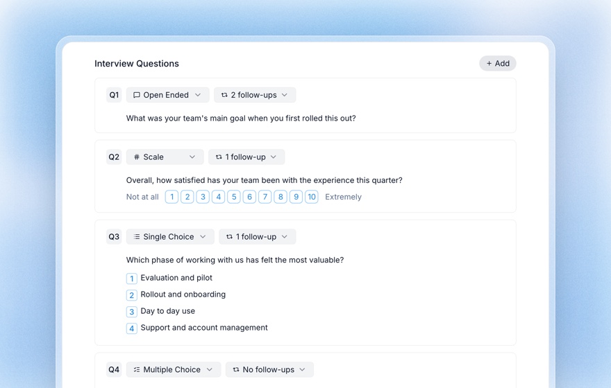
- Ask the bank in order. Put your five questions in the order above. Set follow-ups per question, from none to three, so a quick recall check stays one question and the "who is it for?" question gets probed.
- Mix in structured checks. Structured questions sit in the same interview: a yes/no "Did you see a price?" after the open recall, a scale for trust, or a single choice of brand words with the options shuffled for each person.
- Read the reasons. The report groups open answers into themes with the quotes behind each, next to the charts for your structured questions.
Timed images work in text and voice interviews, not on phone calls. Uploaded images are resized, stripped of metadata and stored privately. For the full method, timings and analysis, start with the 5-second test guide.
Try it this week: pick the set for what you're testing, attach your design to the first question with a 5-second view, and send the link to 15 people who match your audience.
Related Resources
- The 5-Second Test: How to Measure First Impressions
- Structured Questions in AI Interviews
- Logo Testing
- Packaging Concept Testing with AI Interviews
- Concept Testing: The Complete Methodology Guide
- First-Click Testing Guide
Sources
- Doncaster, P. (2014). The UX Five-Second Rules: Guidelines for User Experience Design's Simplest Testing Technique. Morgan Kaufmann.
- Lindgaard, G., Fernandes, G., Dudek, C. and Brown, J. (2006). Attention web designers: You have 50 milliseconds to make a good first impression! Behaviour & Information Technology, 25(2).
- Tuch, A. N., Presslaber, E. E., Stöcklin, M., Opwis, K. and Bargas-Avila, J. A. (2012). The role of visual complexity and prototypicality regarding first impression of websites. International Journal of Human-Computer Studies, 70(11), 794–811.
- Nielsen, J. (2011). How long do users stay on web pages? Nielsen Norman Group, drawing on Liu, White and Dumais, Microsoft Research (2010).
- Kuric, E., Demcak, P., Krajcovic, M. and Nguyen, G. (2023). Cognitive abilities and visual complexity impact first impressions in five-second testing. Behaviour & Information Technology; summarised in Smashing Magazine, "Five-Second Testing: Taking A Closer Look At First Impressions (Case Study)", December 2023.
Related Articles
The 5-Second Test: How to Measure First Impressions and Visual Hierarchy (2026 Guide)
A complete guide to the 5-second test — the lightweight UX research method that measures gut reactions, message clarity, and visual hierarchy. Learn how to design questions, recruit participants, analyze results, and combine 5-second tests with AI interviews.
Concept Testing: The Complete Methodology Guide
How to evaluate product and marketing ideas with target audiences before development — covering methods, metrics, sample sizes, and AI-powered approaches.
First-Click Testing: The Complete Guide to Validating Navigation and Findability (2026)
Master first-click testing — the lightweight UX research method that predicts task success. Learn when to use it, how to run one, sample size guidance, and how to combine click data with AI interviews for the why behind the click.
Logo Testing: How to Test a Logo With Real People Before You Commit
How to test a logo with your target audience: what a logo test can and cannot tell you, the five measures that matter, a step-by-step method with a timed first look, a reusable question bank, sample sizes and common mistakes.
Structured Questions in AI Interviews
Mix quantitative data collection — scales, ratings, multiple choice, ranking — with AI-powered conversational follow-up in a single interview.