Logo Testing: How to Test a Logo With Real People Before You Commit
How to test a logo with your target audience: what a logo test can and cannot tell you, the five measures that matter, a step-by-step method with a timed first look, a reusable question bank, sample sizes and common mistakes.
Logo testing means showing a logo to people from your target audience and measuring what they remember, what it tells them about the company and whether it fits the brand you are trying to build. The most useful tests do not ask "Do you like it?". They show the logo briefly, ask what people recall and what kind of company they picture, then compare those answers across two to four candidates. Liking is the least useful number in a logo test, because a new mark almost always loses to a familiar one at first.
This guide covers what a logo test can and cannot tell you, the measures that matter, a step-by-step method, a reusable question bank and the mistakes that sink most tests.
Why test a logo at all
A logo is cheap to change on a design file and expensive to change once it is on a product, a website, packaging and every sales deck. Two well-known redesigns show what happens when the reaction comes after the launch:
- Tropicana, 2009. PepsiCo replaced Tropicana's packaging, including the logo, in January 2009. According to Information Resources Inc. data reported by Ad Age, unit sales of Tropicana Pure Premium fell 20% between 1 January and 22 February, and dollar sales fell 19%, about $33 million. The company announced on 23 February that it would bring back the old design, less than two months after the change.
- Gap, 2010. Gap introduced a new logo on 6 October 2010 and went back to the old blue box on 12 October, after a wave of criticism online. Marka Hansen, then president of Gap North America, said the company "did not go about this in the right way" and "missed the opportunity to engage with the online community."
Neither case proves a test would have saved the launch. Both show that customers have strong, fast reactions to brand marks, and that those reactions are much cheaper to hear before launch than after.
What a logo test can and cannot tell you
People judge visual design very fast. Lindgaard and colleagues (2006) showed web pages to participants for just 50 milliseconds and found their ratings of visual appeal were consistent with ratings made after a 500 millisecond view. First impressions of a design form almost instantly, and they are fairly stable.
That is good news for logo testing: a short exposure gets a real reaction. But a logo test has limits you should plan around.
It can tell you:
- whether people can recall the name or shape after a brief look
- what the logo suggests about the company: industry, price level, personality
- whether it fits the words you want associated with the brand
- whether it is confused with a competitor
- whether it carries a meaning you did not intend, in some markets or groups
It cannot tell you:
- how people will feel about it after a year of seeing it on a product they like. Familiarity raises liking, an effect psychologists call the mere exposure effect, first described by Robert Zajonc in 1968. A new logo competing against your current one starts at a disadvantage on liking alone.
- whether it will "work" commercially. A logo takes on the reputation of the company behind it over time, good or bad. No test can show you that in advance.
So test for communication and fit, not for a popularity contest.
The five measures that matter
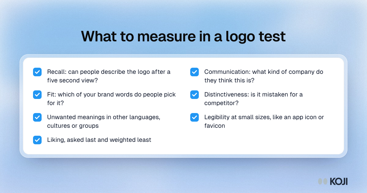
- Recall. After a short view, can people describe the logo or name? A mark people cannot remember after five seconds has a harder job ahead.
- Communication. What kind of company do they think this is? What does it sell, who for, at what price? Compare the answers with your positioning.
- Fit with brand attributes. Give people your three to five target words (for example "trustworthy", "modern", "for professionals") alongside a few you want to avoid, and ask which describe the logo.
- Distinctiveness. Does it remind them of another company? Show it next to two or three competitor logos and ask which is which.
- Problems. Unwanted associations, meanings in other languages or cultures, and legibility at small sizes such as an app icon or a favicon.
Liking can be a sixth measure. Ask it last and weight it least.
How to run a logo test, step by step
- Pick two to four finalists. More than that and people blur them together. Include your current logo if you have one, so you have a baseline.
- Write down what the logo should communicate. Three to five brand words and one sentence on who the company is for. This is what you score against.
- Recruit people from your target audience. Existing customers react to change; prospects react to the mark itself. If you are rebranding, test both groups and report them separately.
- Start with a timed first look. Show one logo for about five seconds, hide it, then ask what people remember and what kind of company they think it is. This is the logic of a five-second test.
- Then show it again, for as long as they like, and ask the fit and association questions.
- Rotate the order. If each person sees more than one logo, change which one comes first, or use a monadic design where each person sees only one. Otherwise the first logo shown colours every answer after it.
- Show it in context last. On a product, an app icon, a storefront or a letterhead. Many logos that look fine on a white page fail at 32 pixels.
- Analyse the open answers by theme and compare candidates on recall, communication and fit, not on a single "favourite" vote.
A logo test question bank
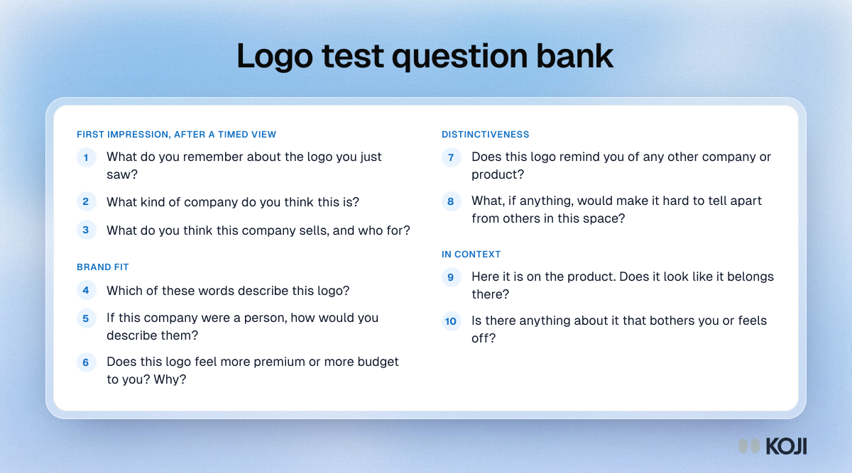
Use these as a starting point and adjust the wording to your brand:
First impression (after a five-second view)
- What do you remember about the logo you just saw?
- What kind of company do you think this is?
- What do you think this company sells, and who for?
Brand fit
- Which of these words describe this logo? (show your target words mixed with words you want to avoid)
- If this company were a person, how would you describe them?
- Does this logo feel more premium or more budget to you? Why?
Distinctiveness
- Does this logo remind you of any other company or product?
- What, if anything, would make it hard to tell apart from others in this space?
In context
- Here it is on the product. Does it look like it belongs there?
- Is there anything about it that bothers you or feels off?
Follow every answer with "What makes you say that?". The reasons are where you find out that "modern" meant "cold", or that a shape reads as a medical cross.
How many people to test with
For a qualitative logo test focused on reasons and associations, 15 to 30 people per logo usually surfaces the main themes. If you want to compare candidates on shares, such as the percentage who correctly recall the name, aim for at least 30 people per logo, and more if the differences are small. The survey sample size guide covers the maths.
Common mistakes
- Asking "Which do you like best?" first. It turns the test into a beauty contest and primes every later answer. Ask about recall and meaning first.
- Testing the new logo against the old one on liking. The old one has years of familiarity behind it. Compare them on communication and fit instead.
- Showing logos side by side for the first look. People compare instead of reacting. Show one at a time.
- Testing only on a white background. Check the logo at small sizes and in the places it will actually live.
- Testing with designers and colleagues. They look at craft. Customers look at what it says about the company.
- Letting one loud comment decide. One person seeing a rude shape is worth checking; it is not a verdict. Look at how often a theme comes up.
Running the test with real people
A logo test lives or dies on the people in it. Recruit from the audience you want to win, not from whoever is nearby. Give each person a quiet first look without anyone explaining the design, because a designer's explanation becomes the answer. And let people talk: the most useful findings in logo tests are usually in a throwaway remark ("it looks like a bank") rather than in a rating.

Photo by Sweet Life on Unsplash
How Koji helps
Koji runs AI-moderated interviews by voice or text, so every logo reaction comes with the reasons behind it.
- Attach the logo to any question. Upload an image of a logo, a mockup or the logo on a product, and participants see it with the question. Koji knows what the image shows, so its follow-up questions are about the logo, not generic.
- Timed first-impression views. Set an image to be shown once, full screen, for 3, 5, 10 or 15 seconds, then hidden. Koji then asks what people remember and what they think, which is exactly the first step of a logo test.
- Follow-ups that ask why. For each question you choose how many follow-ups Koji asks, from none to three, so "it looks cheap" turns into what specifically made it look cheap.
- Fair comparisons. Choice questions can shuffle their answer options for each participant, with the last few options kept in place for answers like "None of these", so brand words and candidate names are not always read in the same order.
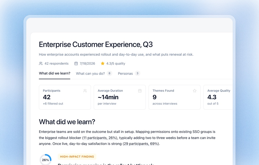
- Themes, not just votes. The report groups open answers into themes with the quotes behind each one, so you can compare logos on what they communicate.
Images work in text and voice interviews, not on phone calls. Uploaded images are resized, stripped of metadata and stored privately. You can pair a logo test with a purchase intent question or a price test when you are testing a whole new brand or package.
Related Resources
- Five-second test guide
- Preference testing guide
- Monadic testing guide
- Brand perception survey guide
- Name testing research
- Structured questions guide
Sources
- Lindgaard, G., Fernandes, G., Dudek, C., & Brown, J. (2006). Attention web designers: You have 50 milliseconds to make a good first impression! Behaviour & Information Technology, 25(2), 115–126.
- Advertising Age (2009). Tropicana line's sales plunge 20% post-rebranding. April 2009, reporting Information Resources Inc. data.
- Christian Science Monitor (2010). New Gap logo withdrawn: The "blue box" lives on. 12 October 2010.
- Zajonc, R. B. (1968). Attitudinal effects of mere exposure. Journal of Personality and Social Psychology, 9(2), 1–27.
Related Articles
The 5-Second Test: How to Measure First Impressions and Visual Hierarchy (2026 Guide)
A complete guide to the 5-second test — the lightweight UX research method that measures gut reactions, message clarity, and visual hierarchy. Learn how to design questions, recruit participants, analyze results, and combine 5-second tests with AI interviews.
Monadic vs Sequential Monadic Testing: The Complete Concept Testing Guide
A practical guide to monadic and sequential monadic testing — the two core concept-testing designs. Learn how each works, the sample-size trade-off, when to use which, and how to run clean concept tests faster with AI.
Name Testing: How to Validate a Product or Brand Name With Real Customers
Name testing is the research method for choosing a product, brand, or feature name by measuring how real customers react to it. This guide covers what to measure, how to avoid the classic "pick the favorite" trap, and how to run name testing at scale with AI interviews.
Preference Testing: The Complete Guide to Validating Design Choices (2026)
A complete guide to preference testing in UX research — when to use it, how to write the questions, how to calculate sample size, how to analyze the results, and how AI-native research with Koji turns binary "A or B" votes into qualitative insight in minutes.
Structured Questions in AI Interviews
Mix quantitative data collection — scales, ratings, multiple choice, ranking — with AI-powered conversational follow-up in a single interview.
5-Point vs 7-Point Likert Scale: How Many Scale Points Should You Use? (2026)
A decision guide for rating-scale length — what the reliability research actually says about 5 vs 7 points, the odd-vs-even and neutral-midpoint debates, when each fits, and how AI follow-ups make any scale richer.