Checkout usability testing for a small online store means giving five people who could plausibly be your customers one real shopping task each, watching them try to get from a product page to the pay button, and asking what happened in their own words. It takes an afternoon and costs little. The decision it settles is what to fix in your checkout first, before you pay for another abandoned-cart app or more ads that send people into a flow they can't finish. By the end of this playbook you'll have the tasks, the questions to ask after each one, a rule for what to fix first, and a way to run it this week with shoppers who have never seen your store.
When you need this
You need this when you can see people starting checkout and not finishing, and you can't see why. The signs are familiar to anyone running a small store: your platform's abandoned-checkout list grows every week, the recovery emails bring a few orders back but never explain anything, and you've changed the button colour twice with no clear effect.

Photo by Vitaly Gariev on Unsplash
Some abandonment is normal. Across 50 published studies from 2006 to 2025, the average documented cart abandonment rate is 70.22%, according to Baymard Institute [1]. Many of those people were never going to buy that day: in Baymard's survey of US online shoppers, the biggest single group abandoned because they were "just browsing" [1]. The part you can fix is the rest. Among the reasons shoppers gave for leaving during checkout, 40% said extra costs such as delivery, tax or fees were too high, 20% said delivery was too slow, 18% didn't want to create an account and 17% found the checkout too long or complicated [1].
Those are averages across big retailers. Your checkout has its own problems, and you can't see them because you've used it a hundred times. Even the big sites get this wrong: in Baymard's 2026 benchmark of leading US and European ecommerce sites, 59% had checkout usability rated "mediocre" or worse on desktop and on mobile [2]. Guessing is expensive here. Every fix you ship for the wrong reason is a week of lost orders you never get back.
The method in brief
This is a small usability test: people try a task while thinking out loud, and you watch what they do rather than ask what they'd do. It's the right method because checkout problems are behaviour problems. Ask shoppers in a survey why they didn't buy and you get "too expensive". Watch them try and you see that the delivery cost only appeared on the last screen, or that the discount code box made them leave to hunt for a code.
Three Koji reference docs cover the parts in depth: how to write usability test tasks, the think-aloud method and task success rate and time on task. If you want to ask people who already abandoned, the cart abandonment research guide covers exit interviews. This playbook is about watching new shoppers try, which finds the problems before they cost you more carts.
Why five people? Jakob Nielsen's model, from his 2000 article, estimates that five users find about 85% of the usability problems in a design, and that several small rounds beat one large one [4]. Laura Faulkner tested that in 2003 by drawing groups at random from 60 participants, 100 times per group size. Five users found 85% of the problems on average, but the unluckiest group of five found only 55%. Ten users found 95% on average and never fewer than 82% [5].
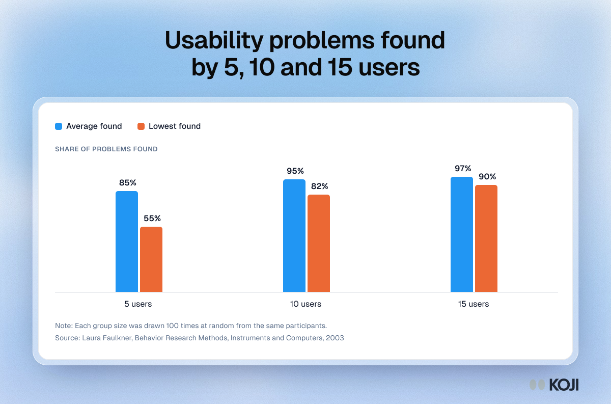
So plan for two rounds of five: one to find the worst problem, one after you fix it to check the fix worked and catch what the first group missed.
Step by step
1. Decide which device to test on
Test on phones first. Contentsquare's 2026 benchmark found that 77% of retail site traffic came from mobile devices in 2025, and that desktop still converted better: 3.7% against 2% on mobile [3]. That gap is where small stores lose the most, and it's the version of your checkout you look at least, because you probably manage the store from a laptop.
If your own analytics say most of your buyers are on desktop, test there instead. Use your numbers over a benchmark.
2. Pick the path and where it stops
The path runs from a product page to the final pay button. Stop there. You don't need real orders to find problems, and nobody wants to explain a test charge to their bank. If you want people to see the confirmation page and emails too, give them a 100% discount code for one item and cancel the orders afterwards.
Write down every screen on the path before anyone tests it: product page, cart, delivery details, delivery options, payment. You'll tally results against this list.
3. Write three tasks in shoppers' words
A task is a goal with a reason, not an instruction. "Click Add to cart" tests nothing. "Find a gift for under €30 that would arrive by Friday" makes people do what real shoppers do: compare, check delivery, look for the total. Keep the words on your buttons out of the task, or you're telling people where to click.
Three tasks are enough for one session of about 15 minutes. One should be a straight purchase, one should involve delivery timing or cost, and the third should check whatever you suspect: returns, sizing, a discount code, guest checkout.
4. Recruit five people who could buy but haven't
You want fresh eyes. Regular customers already know where everything is, so they make your checkout look easier than it is. The best testers are people who match your customers and have never bought from you:
- Your email list or social followers who signed up but never ordered. They're interested and new to the checkout.
- People in the same groups as your customers: a local parents' forum, a hobby community, a trade Facebook group. Ask the moderator first.
- Friends of friends who shop online for this kind of thing. Not your own friends, who will try too hard to be nice.
- A research panel, if your customers are a broad consumer group and you'd rather not ask around.
A small thank-you helps: a discount on a future order or a gift card. The participant incentives guide has typical amounts. For who to leave out and how to screen, see which customers to interview from a mixed list.
5. Run it and stay quiet
Ask people to think out loud as they go, then say nothing. When they ask "should I click this?", answer "what would you do if I weren't here?" The moment you help, you've hidden the problem you were looking for.
After each task, ask the same questions, in the same words, to every person. This is the bank to use:
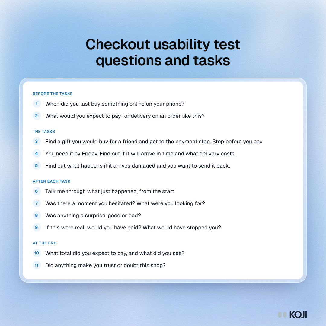
The question that earns its place is "Was there a moment you hesitated?" People rarely volunteer a hesitation, because they got past it. But a pause on the delivery screen is exactly where a less patient shopper leaves.
6. Tally per person, not per comment
For each person and each task, write down three things: did they reach the pay button, how long it took, and where they hesitated or got lost, against your list of screens. A problem that three of five people hit is a pattern. One person's struggle is a note to watch for in round two.
A worked example
Say you run a two-person online shop selling loose-leaf tea and teaware, with most orders coming from Instagram. Your platform shows plenty of started checkouts and not many orders, and you suspect delivery costs.
You write three tasks: "Buy a tin of any green tea for yourself", "You want a gift set to arrive by Saturday. Find one and get to the payment step" and "Check what happens if the teapot arrives broken." You recruit five followers who have liked posts but never ordered, offer each a discount code for later, and run the sessions on their phones.
Here is what such a round might show. Four of five reach the pay button on the first task, but three hesitate on the delivery screen because the cost appears there for the first time. Two of five give up on the gift task: the delivery date isn't shown anywhere, so they can't tell whether Saturday is possible. One person can't find the returns policy and says they would rather buy from a big marketplace they already trust.
The decision writes itself. The gift task failure is the blocker, because two people couldn't finish, so you add estimated delivery dates to the delivery options. The surprise delivery cost is the pattern, because three people hit it, so you add a line on the product page: "Delivery from €4.50, free over €40." The returns link waits for round two. A week later, five new followers run the same tasks. All five finish the gift task and nobody mentions delivery cost.
None of this needed a funnel tool or a redesign. It needed five people, three tasks and the discipline to keep quiet.
Reading the results and deciding
Use the same rules every round, so you don't argue yourself into the fix you already wanted:
- Two or more of five stopped before the pay button on a task: that's a blocker. Fix that step before anything else, and re-test it with five new people.
- Anyone was surprised by the total: show delivery cost earlier, on the product page or in the cart. Extra costs are the most common reason shoppers give for leaving [1], and a surprise at the last step is the worst place for it.
- Three or more hesitated at the same screen: fix it this round, even though they finished. Your testers are more patient than real shoppers.
- One person struggled with something nobody else did: note it and watch for it in round two.
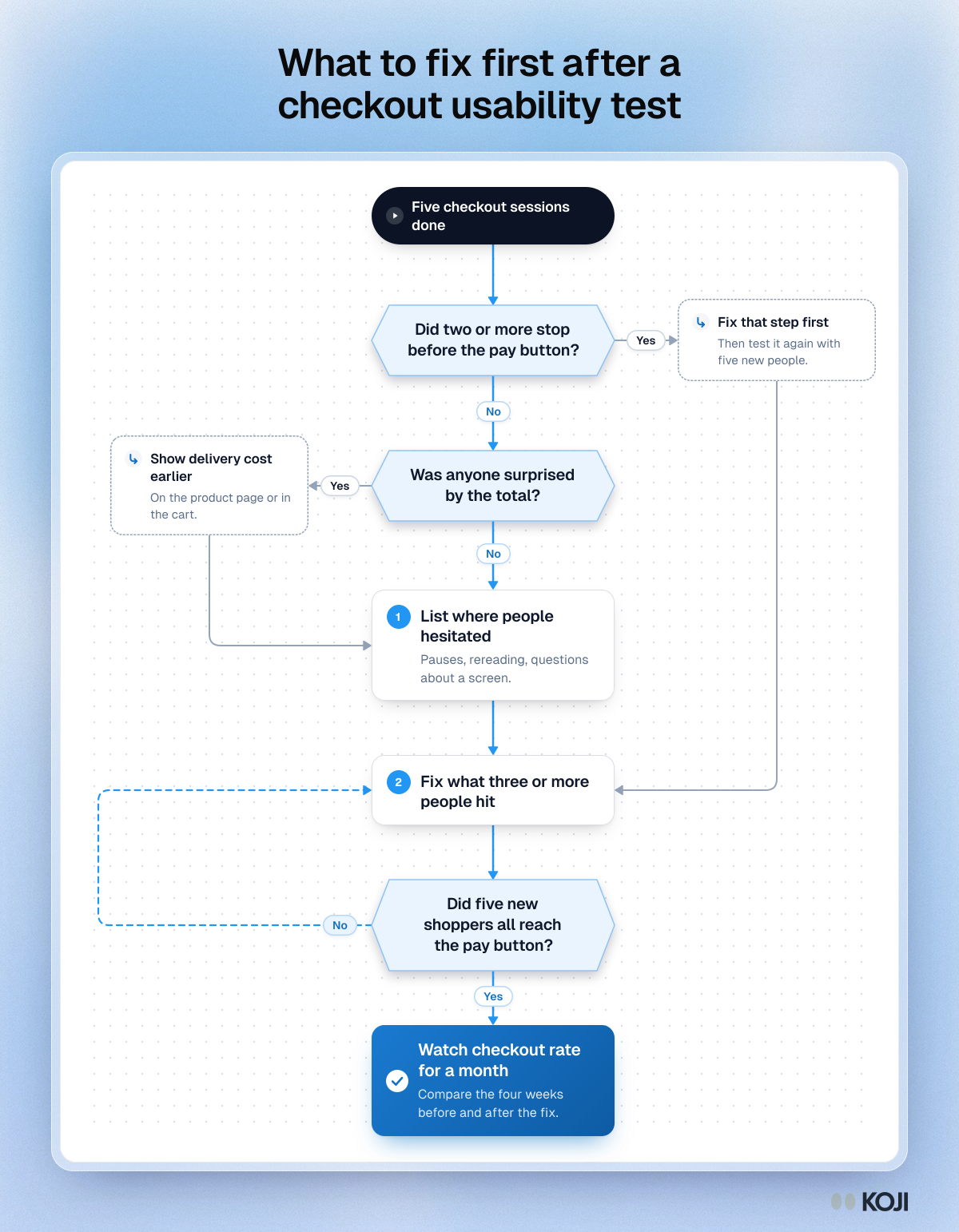
After the fix, compare your platform's checkout completion rate for the four weeks before and after. With a small store, weekly numbers bounce around, so a month is the shortest window worth reading.
Run it this week with Koji
You can run all of this by hand with a video call and a notepad. Where Koji helps is the part small store owners have no time for: booking five sessions, staying quiet while someone struggles, and asking the same follow-ups every time. Koji's usability testing runs each session for you, so shoppers can do it whenever suits them.
- Create a study and describe what you want to learn ("why shoppers on phones don't finish checkout"). The research assistant drafts the questions; swap in the bank above.
- Add a Task question for each task. Enter your store's web address and the task text. The participant gets a task card that opens your page, and "I'm done" and "I'm stuck" buttons stay on screen. When they press one, Koji asks what happened, in neutral words, then carries on with your after-task questions.
- Add your other questions around the tasks. Open questions, rating scales and choice questions can sit in the same study, so the before and end questions go in as normal questions.
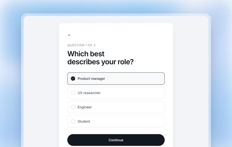
- Add a screening question so only the right people take part: for example, whether they've bought something online on their phone in the last three months. Anyone who doesn't qualify is turned away before the interview starts.
- Share the link with your followers or list, or recruit from Koji's research panel if you'd rather not ask around. Launching a panel needs a paid plan, and so do incentives paid through Koji.
- Read the report. It has a task section for each task: how many finished and how many got stuck, the median time on task, and what each person said about it. On desktop, where participants agree to share their screen, it also shows a reel of recorded moments, a verdict per participant and the pages they went through.
Be clear on two limits before you start. Screen recording only works on a desktop browser that can share a tab. On a phone, the page opens in a new tab and people come back to say how it went, so you get whether they finished, how long it took and the conversation, but no recording. If you need to watch a phone checkout, do a couple of sessions in person alongside the Koji ones. And Task questions are marked Beta in the product: each task adds 3 credits to every completed interview, shown before you launch.
Common mistakes
- Testing with regulars. They know your checkout. Use people who've never bought.
- Testing only on your laptop. Most of your shoppers are probably on a phone [3].
- Writing tasks with your button labels in them. "Click Checkout now" tells people where to go.
- Helping when they get stuck. Every hint hides a problem that real shoppers will hit alone.
- Fixing everything at once. If you change five things and completion improves, you don't know which one worked, and you can't tell if one of them made it worse.
- Stopping after one round. Faulkner's unluckiest five found only 55% of the problems [5]. The second round is where you find out whether the fix worked.
When usability testing will mislead you
A usability test shows you whether people can buy. It can't tell you whether they want to. Testers are on a task you gave them, with your product in front of them, so they push through things a real shopper would give up on, and they rarely balk at a price because it isn't their money.
So pair it with what real shoppers do. Your abandoned-checkout list shows which step real people leave at; if your test points at a different step, trust the real data and test that step next. If your test finds nothing and checkout completion is still low, the problem may be the offer or the price, not the checkout. Then talk to people who left, which is the next playbook in the path.
Where this fits
This sits in the "why do customers leave or not come back?" decision on the founder's research playbook for small businesses. Before it, which customers to interview from a mixed list helps you pick the right people. After it, why customers leave a small business covers the people who bought once and never came back. If you're building software rather than running a store, the same method for a product is in how to usability test your MVP. More founder playbooks live at Koji for founders.
FAQ
How many people do I need for a checkout usability test? Five per round, and two rounds. Five people find about 85% of usability problems on average, but a single group of five can miss nearly half [4][5]. A second round after your fix catches what the first missed.
Should I test on mobile or desktop? Test where your shoppers buy. For most small stores that's a phone: 77% of retail site traffic in 2025 came from mobile devices [3]. Check your own analytics first.
Do testers have to place a real order? No. End each task at the final pay button. If you want them to see the confirmation page, give them a 100% discount code and cancel the orders afterwards.
Can I test with friends and family? Friends of friends, yes. Your own friends and regular customers, no: friends try too hard to be kind and regulars already know where everything is.
What do I fix first? Anything that stopped two or more of five people from reaching the pay button. Then anything that surprised people about the total. Then hesitations that three or more people shared.
Why not just look at my analytics? Analytics tells you which step people leave at, never why. Use it to choose what to test, then watch five people to see the reason.
Next step
Pick the three tasks today, then set them up as Task questions in Koji and send the link to five followers who've never ordered. You'll know what to fix by the end of the week.
References
- Baymard Institute. "Cart Abandonment Rate Statistics." Baymard Institute, updated 2025. https://baymard.com/lists/cart-abandonment-rate
- Baymard Institute. "Checkout UX Best Practices 2026: The Current State of Checkout UX." Baymard Institute, 2026. https://baymard.com/research-articles/current-state-of-checkout-ux
- Contentsquare. "How to Optimize Digital Experience on Retail Sites in 2026" (from the 2026 Digital Experience Benchmark). Contentsquare, 2026. https://contentsquare.com/guides/retail-digital-experience/
- Jakob Nielsen. "Why You Only Need to Test with 5 Users." Nielsen Norman Group, 2000. https://www.nngroup.com/articles/why-you-only-need-to-test-with-5-users/
- Laura Faulkner. "Beyond the five-user assumption: Benefits of increased sample sizes in usability testing." Behavior Research Methods, Instruments, and Computers 35(3), 2003. https://pubmed.ncbi.nlm.nih.gov/14587545/
Further reading
- Baymard Institute's checkout usability research. The largest public body of checkout testing. Read the free articles before you write your tasks, so you know the common traps.
- Jakob Nielsen, "Why You Only Need to Test with 5 Users". Short, and the clearest case for small, repeated rounds instead of one big test.
- How to write usability test tasks and scenarios. Koji's guide to tasks that don't give the answer away, with examples you can adapt.
- The think-aloud protocol. How to get people talking while they shop, and when silence is better.