The Rainbow Spreadsheet: A Fast Way to Synthesise Usability Sessions as a Team
A rainbow spreadsheet lets a team colour-code what each participant does during usability sessions, so the most common issues are visible by the last session. How to set it up and run it.
A rainbow spreadsheet is a shared spreadsheet for synthesising usability test sessions as a team, while the sessions are still running. Each row is an observation, such as "Didn't notice the filter button", and each participant gets a column with their own colour. Whenever an observer sees a participant do or say something that matches a row, they colour that participant's cell. By the end of the sessions, the rows with the most colour are your most common issues, and everyone who watched has already agreed on what they saw. You get from last session to findings in hours instead of days.
This guide covers where the method comes from, how to set up the sheet, how to run it during sessions, how to turn it into findings, and when a different method fits better.
Where the rainbow spreadsheet comes from
Tomer Sharon, then a UX researcher at Google, described the method in "The Rainbow Spreadsheet: A Collaborative Lean UX Research Tool" (Smashing Magazine, 2013). His problem was a familiar one. Usability studies produced long reports that arrived weeks after the sessions, by which time the team had moved on and nobody read them. He wanted the people who would act on the findings to watch the sessions and build the analysis with him as they happened.
The spreadsheet gave them a single place to do that. Because it was visual, a product manager could glance at it and see which problems were common without reading a word of a report. Teams from the UK Government Digital Service to university design programmes have since written up their own versions.
Why it works
- Analysis starts during the sessions. Observers log what they see in real time, so there is no long gap between the last session and the first findings.
- The team owns the findings. Designers, engineers and product managers who coloured the cells themselves are much harder to convince that a problem "was just one user".
- Patterns are visible at a glance. A row coloured across every column is obviously more important than a row with a single cell.
- It needs no special software. Google Sheets or Excel is enough, and everyone already knows how to use it.
Setting up the sheet
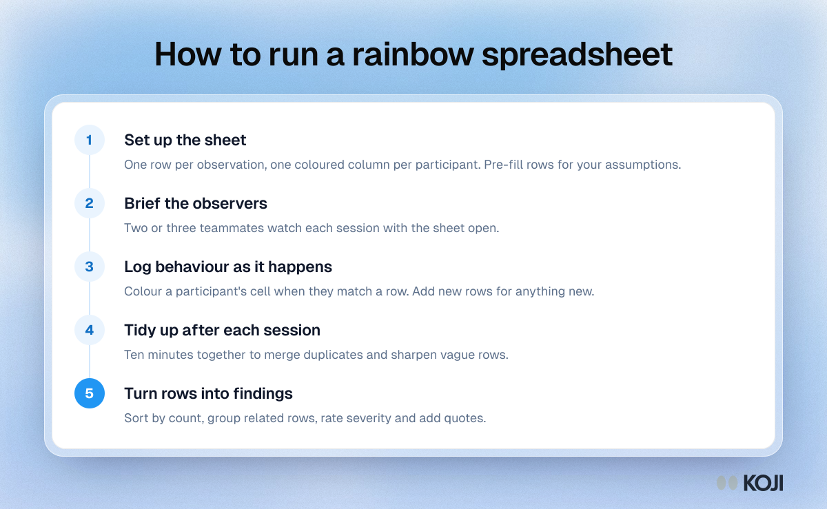
Create one sheet for the study with these columns:
| Column | What goes in it |
|---|---|
| Task or area | The task or part of the product the observation belongs to |
| Observation | One specific behaviour or comment, written as what happened |
| One column per participant | Coloured when that participant showed this behaviour |
| Count | How many participants showed it (a simple formula) |
| Notes and quotes | Short quotes or timestamps that back the observation up |
Then:
- Give each participant a colour. Use a header cell in that colour with a short label, like P1 or "Ana, freelancer". Keep personal details out of the sheet.
- Pre-fill expected observations. Before the first session, write rows for the assumptions you want to test. "Understands what the free trial includes" is a good row. It makes the sheet faster to use in the moment.
- Group rows by task. It keeps the sheet readable when it grows past 50 rows.
- Add a "positive" section. Things that worked well are findings too, and they tell the team what not to break.
Running it during sessions
Invite at least two or three people from the team to watch each session, live or on a recording. Each observer has the sheet open.
- When a participant does something that matches an existing row, colour their cell.
- When they do something new, add a row with a specific description and colour their cell.
- Write behaviour, not interpretation. "Clicked Back three times on the pricing page" is an observation. "Pricing page is confusing" is a conclusion, and it belongs later.
- One observation per row. If a row says "Missed the filter and got lost in search results", split it in two.
- Add a quote or timestamp in the notes column when you can. It makes the finding easy to check and easy to share.
Take ten minutes after each session to tidy the sheet together. Merge duplicate rows, sharpen vague ones and agree on any cells people disagree about. This short debrief is where most of the shared understanding forms.
Turning the sheet into findings
After the last session:
- Sort by count. The rows coloured for most participants come first.
- Group related rows into findings. Three rows about missing the filter, the sort and the search scope may be one finding about how people narrow results.
- Rate severity. Frequency is not the same as impact. A problem that blocks checkout for two participants can matter more than a cosmetic one that annoys everyone. See usability issue severity ratings.
- Write each finding with its evidence. The observation, how many participants showed it, a short quote and a screenshot.
- Share the sheet itself. Many teams skip the formal report and present the sheet with a short summary of the top findings.
A short example
A team tests a new booking flow with six participants. Before the first session they pre-fill eight rows, including "Finds the date picker without help" and "Understands the cancellation policy before paying". By the end of the week the sheet has 41 rows.
Sorted by count, the top row is "Scrolled past the date picker and tapped Continue", coloured for five of six participants. Two related rows, "Looked for dates in the search bar" and "Asked out loud where to choose dates", are coloured for three and two people. Together they become one finding: people do not see the date picker because it sits below the fold on mobile. The team ships a fix the following sprint, because the designer and the engineer who will build it both watched it happen.
Common mistakes
- Vague rows. "Had trouble with navigation" cannot be coloured consistently. Name the behaviour.
- One observer. The method's value comes from several people watching and agreeing. With one person, it is just a log.
- Treating counts as statistics. With five to eight participants, "4 of 6" shows a pattern worth acting on. It is not a percentage of your user base.
- Letting the sheet grow without tidying. Without a short debrief after each session, you end up with near-duplicate rows and colour that means nothing.
- Mixing in personal data. Use labels, not full names or emails.
When to use something else
The rainbow spreadsheet is built for a handful of observed sessions with the same tasks, typically moderated usability tests. It struggles in two situations:
- Open, exploratory interviews, where every conversation goes somewhere different. Affinity mapping or thematic analysis fit better.
- Large numbers of participants. At 30 or 50 interviews, colouring cells by hand becomes slow and inconsistent.
Getting the same "who said what" view from AI interviews
When you run research as AI-moderated interviews in Koji, the report gives you a version of the rainbow spreadsheet's core view without anyone colouring cells. Each finding shows how many participants it is backed by, as a share and a count, and a View supporting responses button opens the quotes behind it. Themes are pulled from every interview automatically, and you can refresh the report as new interviews come in.
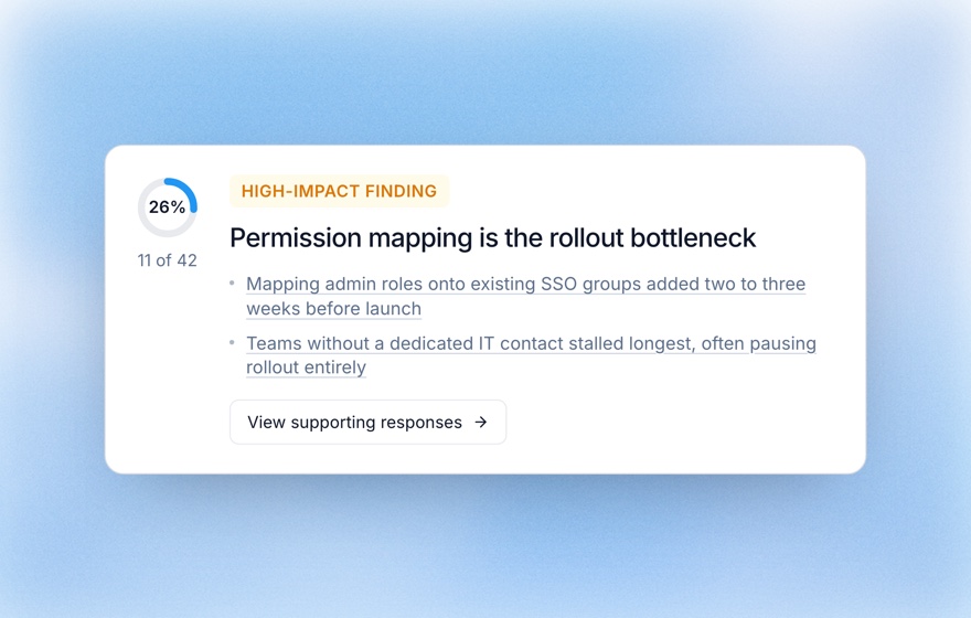
Teams often combine the two. They run five or six moderated usability sessions with a rainbow spreadsheet to see behaviour, then run a larger set of Koji interviews to hear why people struggle and how widespread it is. If you add a few structured questions, such as a scale question on how easy a task felt, you also get numbers you can compare across rounds. See tracing report findings to evidence for how to check each finding against what people said.
Related Resources
Related Articles
Affinity Mapping: Organize Qualitative Data Into Themes
Learn how to use affinity mapping to group qualitative research data into meaningful clusters and uncover actionable patterns.
Moderated Usability Testing: How to Run Sessions That Surface Real Problems (2026 Guide)
A practical 2026 guide to moderated usability testing: how to write tasks, run think-aloud sessions, measure task success and SEQ, choose sample size, and scale moderation with AI on Koji.
Rapid Qualitative Analysis: How to Get From Interviews to Findings in Days
Rapid qualitative analysis replaces line-by-line coding with summary templates and a participant-by-topic matrix. How the Hamilton method works, what the evidence says, and how to run one.
Structured Questions in AI Interviews
Mix quantitative data collection — scales, ratings, multiple choice, ranking — with AI-powered conversational follow-up in a single interview.
Tracing Report Findings Back to the Evidence
Every finding, chart and recommendation in a Koji report links to the interviews behind it. Learn how to open the evidence panel, read supporting quotes and check a finding before you share it.
How to Conduct Usability Testing: The Complete Guide
A comprehensive guide to usability testing for UX researchers and product managers. Covers types of testing, participant numbers, step-by-step facilitation, and the most common mistakes to avoid.